Free Granny Square Blanket Color Ideas. Let’s explore the art and science of selecting color schemes and palettes that will transform your crochet projects from simple squares into stunning works of art.
The humble Granny Square has been a beloved staple in the crocheter’s repertoire for generations. Its simplicity belies its potential for incredible creativity and expression. With just a hook, some yarn, and a rainbow of colors at your disposal, you hold the power to create blankets that are not just warm and comforting, but also visually captivating and deeply personal.
Table of Contents:
Good color combinations for Granny Square Blankets often follow these principles:
Contrast:
Pairing light and dark colors creates visual interest and definition between squares.
Classic Bold Contrast: Black and white is a timeless combination that provides high contrast and a classic look. Adding a pop of a bright color (like red, pink or yellow) can also work well to draw attention.
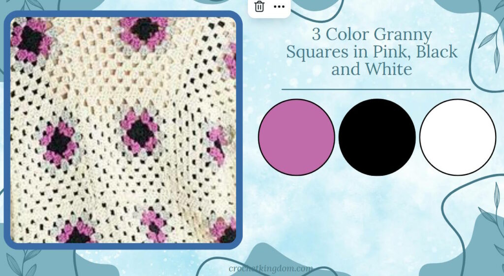
The Ultimate Contrast: Using black and white, the variations with this are endless.
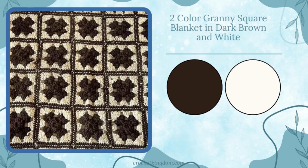
Triadic Color Scheme: This involves using three colors that are evenly spaced around the color wheel, such as red, yellow, and blue. It creates a balanced and harmonious look while still being vibrant.
Harmony:
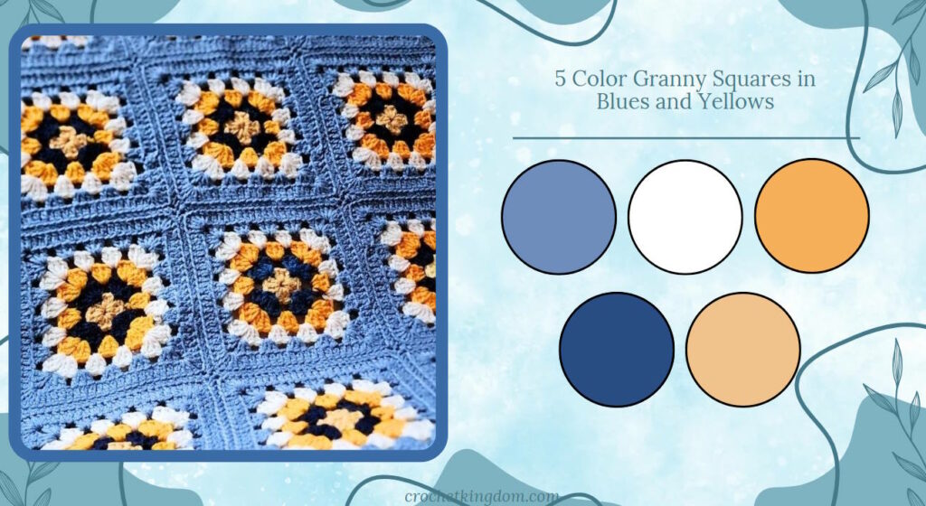
Using colors from the same family (e.g., pastels or jewel tones) creates a cohesive look. This ensures colors complement each other and makes color selection easier. The great thing about using color families is that it produces a professional, well-thought-out appearance.
Applying color harmony to Granny Square blankets involves a thoughtful selection and distribution of colors from the same family.
Begin by choosing a main color that will serve as the foundation of your design, then select 3-5 additional colors from the same family to create a cohesive palette.
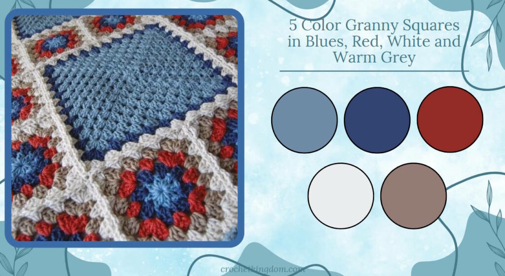
To add depth and interest to your blanket, incorporate lighter and darker shades within your chosen color family. This variation in tone creates visual texture while maintaining overall harmony. Consider introducing a neutral color like white, cream, or gray to your palette, which can provide a visual resting point and accentuate the main colors.
Color Families:
- Pastels: Soft, light colors with white mixed in. Examples include baby blue, light pink, mint green, and lavender.
- Jewel tones: Rich, deep colors reminiscent of gemstones. These include sapphire blue, emerald green, ruby red, and amethyst purple.
- Earth tones: Colors found in nature, such as brown, beige, olive green, and terracotta.
- Neon: Bright, vibrant colors like electric blue, hot pink, and lime green.
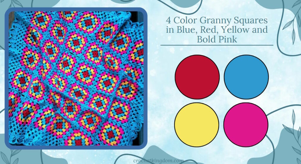
Accent colors:
Accent colors are essential in Granny Square blankets for adding visual interest and depth. They create focal points by drawing attention to specific areas, such as the center or borders of squares. This strategic use of contrasting or vibrant colors can make parts of the blanket stand out, while also enhancing the overall design and creating a sense of balance and harmony.
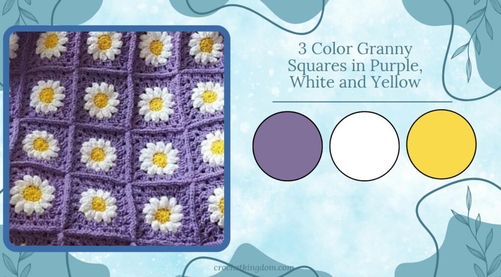
From a design perspective, accent colors can highlight details and add drama, making the blanket more eye-catching. They work well with the main color scheme by providing contrast or complementing the primary colors. By using accent colors in borders, edges, or motifs, you can bring unity to the design and tie different elements together.
In practice, using accent colors sparingly and thoughtfully ensures they enhance rather than overwhelm the main colors. Testing combinations in small samples helps you see how they interact before committing to the full design. Overall, accent colors allow for creative expression and help create a striking and cohesive Granny Square blanket.
Incorporating pops of bright or unexpected colors can add excitement to a neutral palette.
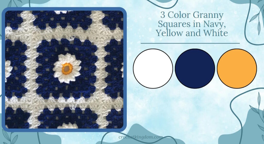
Balance:
Distributing colors evenly throughout the blanket ensures a pleasing overall appearance.
Balancing colors in Granny Square blankets is crucial for creating a visually harmonious and appealing design. Even distribution of colors ensures a cohesive look, prevents any area from overpowering others, and gives the blanket a polished, intentional appearance.
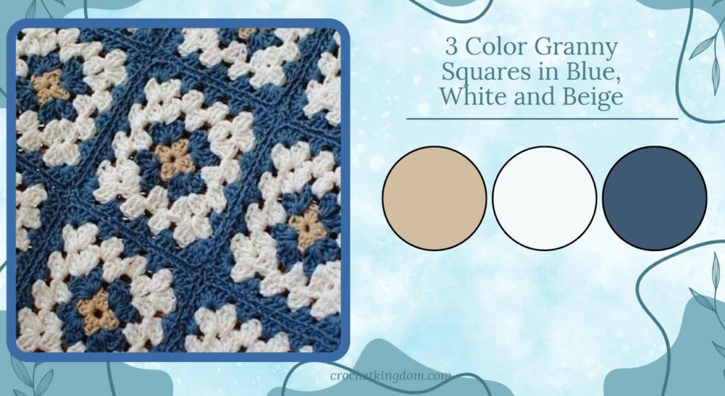
One effective technique is to use repetition with slight variations. Establish a repeating pattern of colors, but introduce occasional changes to keep the design interesting.
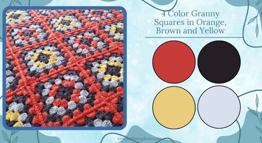
For larger blankets, consider using gradual color transitions to create a sense of flow. Consistently use each color a similar number of times, and try to balance warm and cool tones. Neutral colors can act as buffers between more vibrant hues, helping to harmonize the overall design.
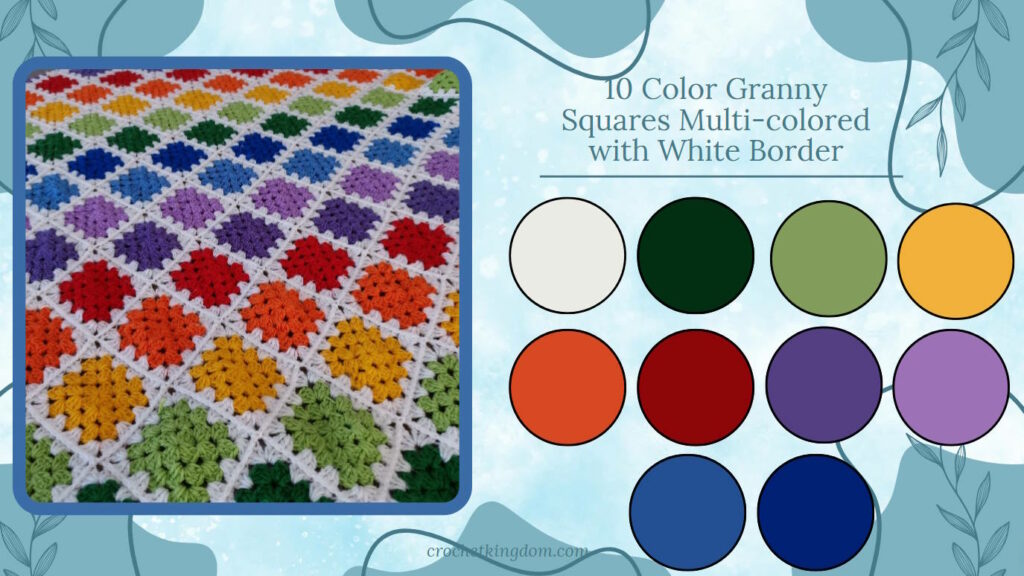
Theme-based:
Choosing colors inspired by nature, seasons, or specific concepts can create a cohesive story.
Tips for creating themed crochet blankets:
- Research: Look at images associated with your chosen theme for color inspiration.
- Balance: Ensure a good balance between your main colors and accent colors.
- Transitions: Consider how colors flow into each other, especially in larger blankets.
- Personal touch: Don’t be afraid to add your own twist to traditional color schemes.
July 4th Theme
July 4th colors are patriotic and celebratory, perfect for a festive summer blanket.
Color palette suggestion:
- Navy blue (night sky)
- Red (stripes of the flag)
- White (stars of the flag)
- Silver or light gray (sparklers)
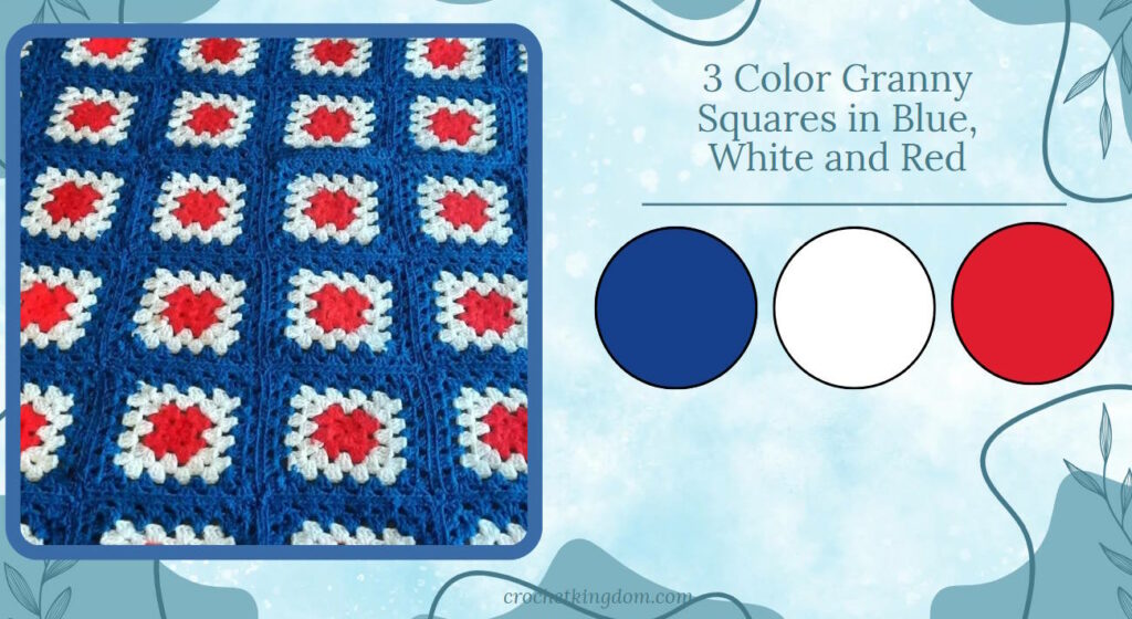
Creating the story: Use navy blue as your base color, representing the night sky. Create patterns of red and white squares to evoke the stripes of the American flag. Intersperse white squares throughout to represent stars. Add occasional silver or light gray squares to symbolize sparklers or fireworks.
Halloween Theme
Halloween colors typically evoke a sense of mystery, spookiness, and autumn.
Color palette suggestion:
- Orange (pumpkins)
- Black (night sky)
- Purple (mystery)
- Green (witch’s brew)
- White (ghosts)
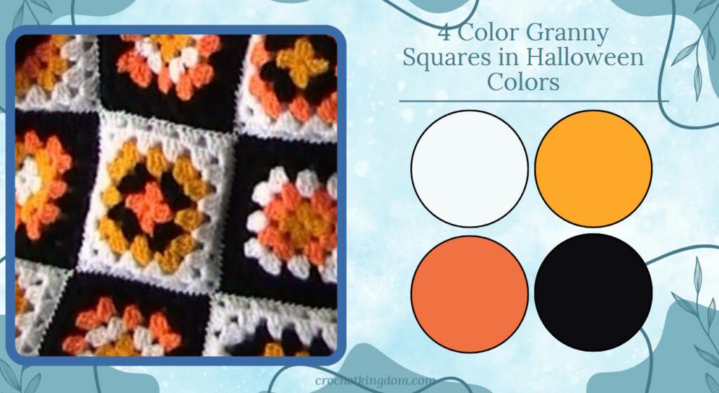
Creating the story: Use orange as your primary color, representing pumpkins and autumn. Intersperse black squares for the night sky and spooky elements. Add pops of purple for mystery, touches of green for a witch’s brew, and occasional white squares to represent ghosts or spider webs.
Halloween – Orange. black and white color palette.
Spring Theme
Spring colors evoke feelings of renewal, growth, and freshness. A spring-themed blanket can capture the essence of blooming flowers and new leaves.
Color palette suggestion:
- Soft green (new leaves)
- Light pink (cherry blossoms)
- Pale yellow (daffodils)
- Light Blue (Spring sky)
- Sky blue (clear spring skies)
Creating the story: Start with a predominantly soft green background, representing the fresh grass and new leaves. Intersperse squares of light pink and pale yellow to represent the first spring flowers. Add touches of lavender and sky blue to complete the spring landscape.
Spring Pallet – Happy and vibrant spring color scheme.
Ombre effect:
Gradually transitioning between shades of the same color family creates a sophisticated look. The ombre effect in Granny Square blankets creates a stunning visual gradient, smoothly transitioning from one color to another. This technique adds depth and sophistication to your project, creating a modern and eye-catching design. To achieve an ombre effect, start with one color at one end of your blanket and gradually introduce shades that are slightly lighter or darker as you progress.
Blue ombre crochet blanket idea. When planning an ombre Granny Square blanket, it’s helpful to arrange your yarn skeins in order from darkest to lightest (or vice versa) before you begin. This visual aid can guide your color placement as you work. Remember, the transitions should be gradual – avoid abrupt changes between shades for the smoothest effect.
Monochromatic:
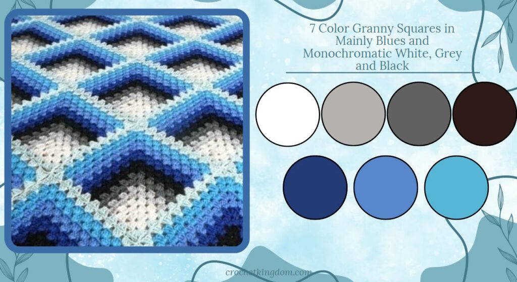
Using various shades and tints of a single color can produce an elegant, modern aesthetic. Monochromatic color schemes in Granny Square blankets offer a sophisticated and harmonious approach to design, focusing on variations of a single color. This technique creates a cohesive and elegant look while still maintaining visual interest through the use of different shades, tints, and tones of the chosen hue.
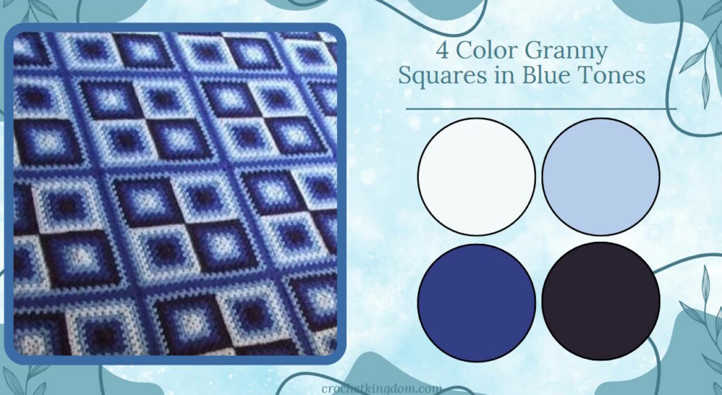
To create a monochromatic Granny Square blanket, select one base color and then incorporate various iterations of that color. For instance, if you choose blue, your palette might include navy, royal blue, sky blue, and pale blue. The key is to vary the intensity and lightness of the color across your squares.
This approach allows for subtle yet striking contrasts within your blanket. Darker shades can provide depth and definition, while lighter tints add brightness and dimension. You can also incorporate neutral shades like white, gray, or beige to break up the color and provide visual rest points.
A monochromatic design doesn’t have to be boring. By varying the patterns within your squares and thoughtfully arranging the different shades, you can create a blanket with rich texture and visual appeal. This style works particularly well for creating a modern, minimalist look or for complementing existing decor without overwhelming it.
Granny Square Color Combinations
From using just two yran colors for a contrasting look to more than 10 colors to effectively use up your yarn stash. Following are great color combination ideas to inspire you.
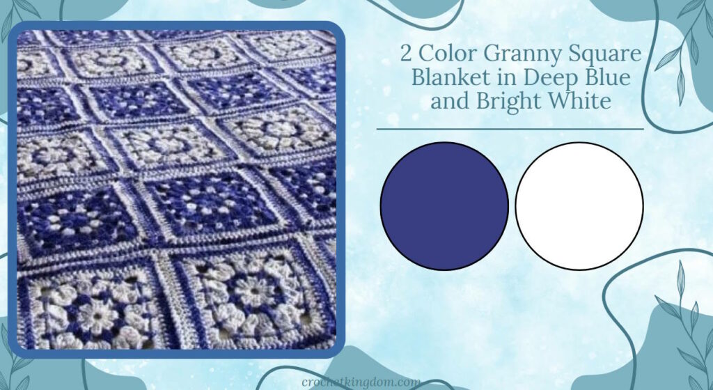
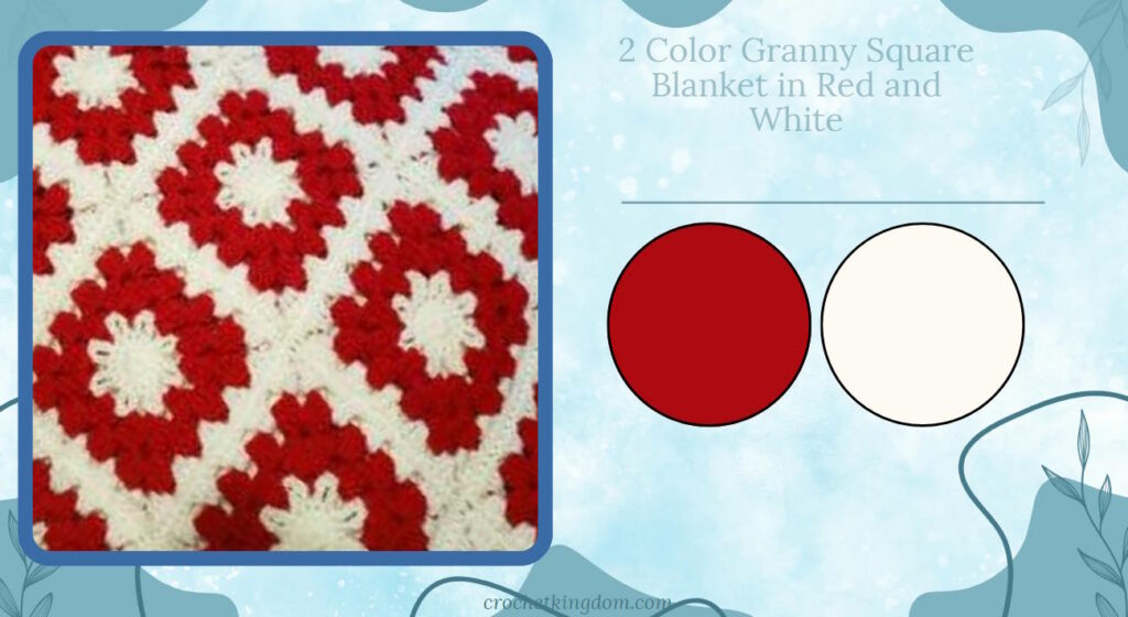
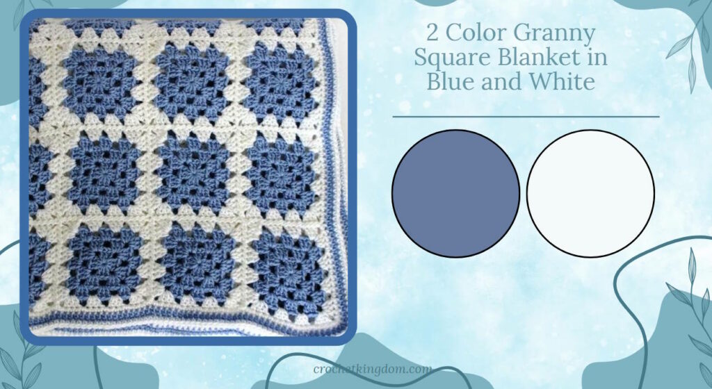
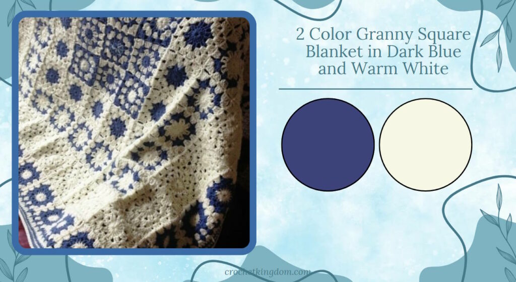
2 Color Granny Square Blanket
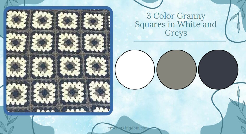
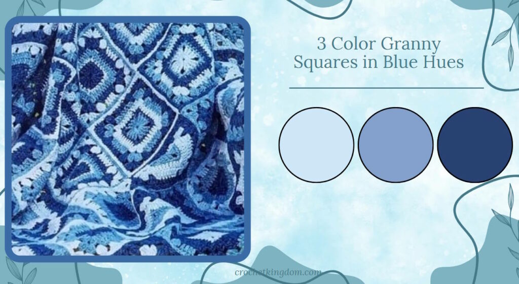
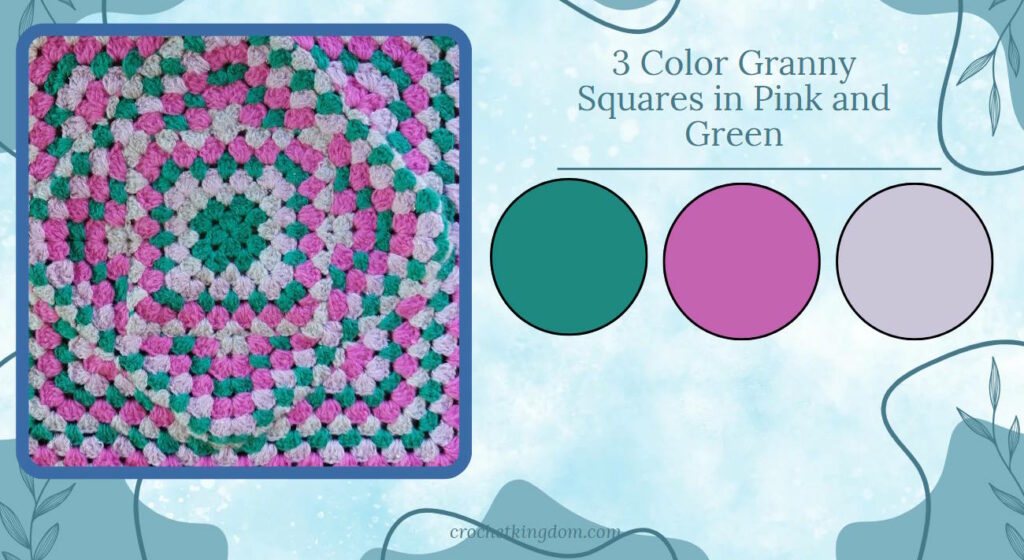
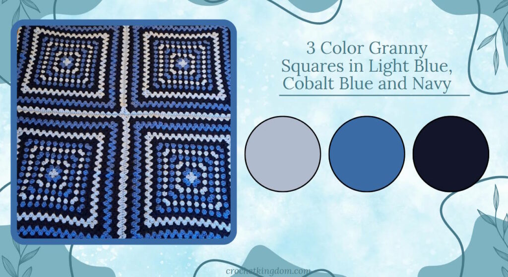
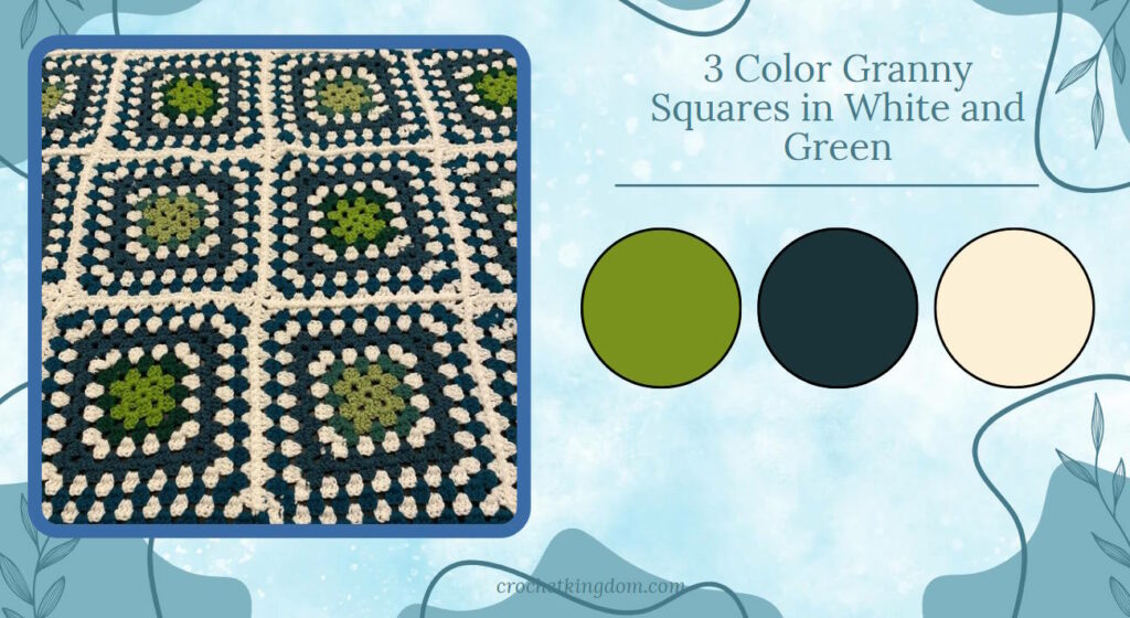
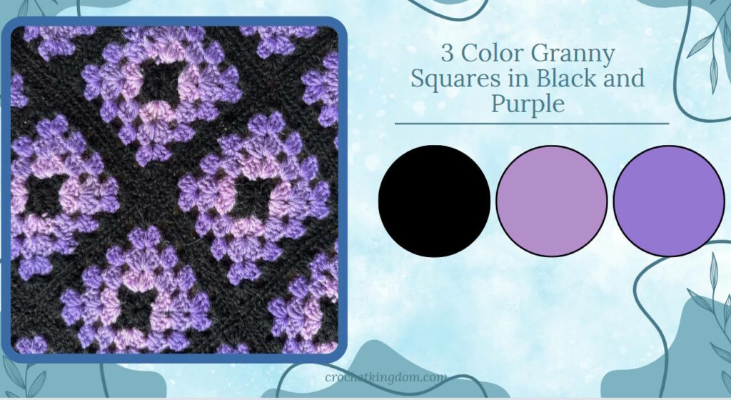
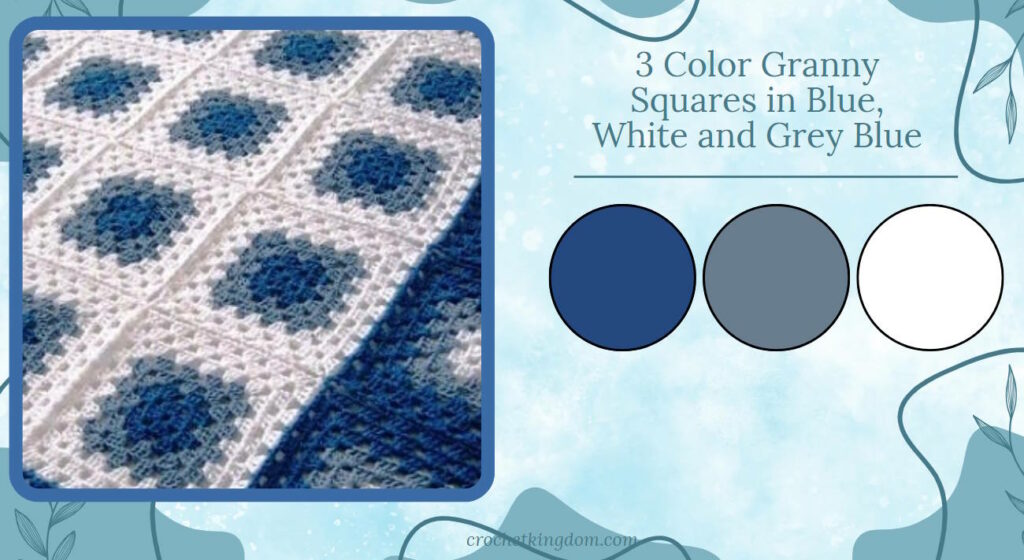
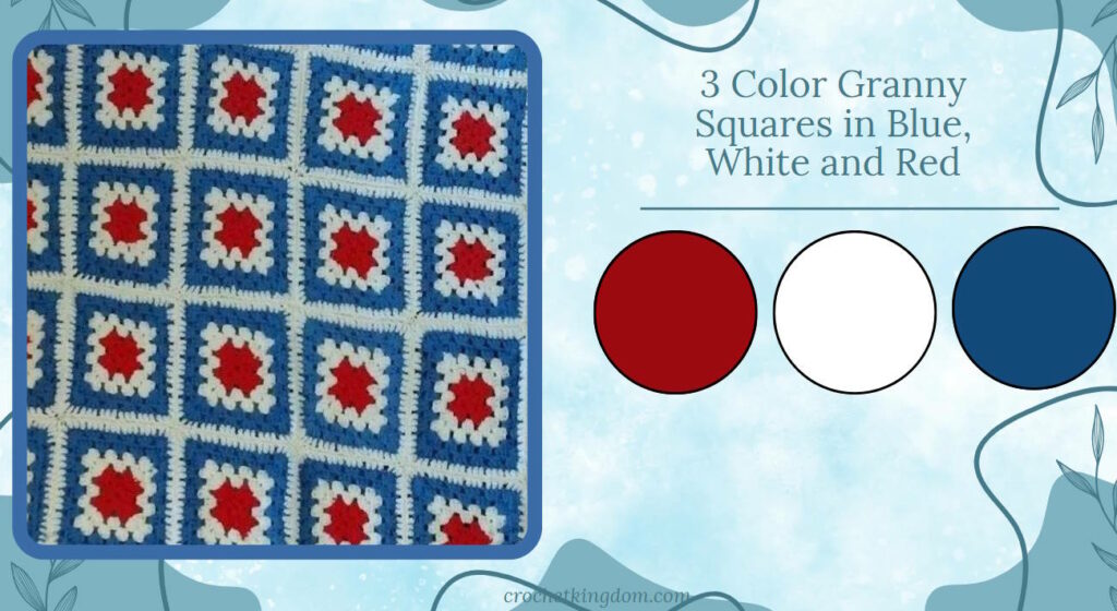
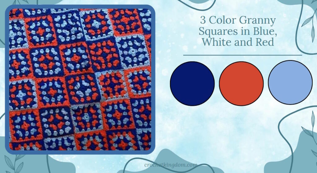
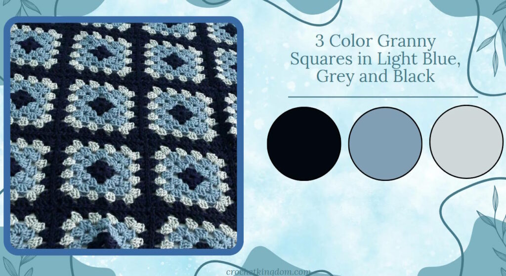
3 Color Granny Square Blanket
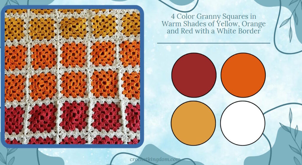
4 Color Granny Square Blanket
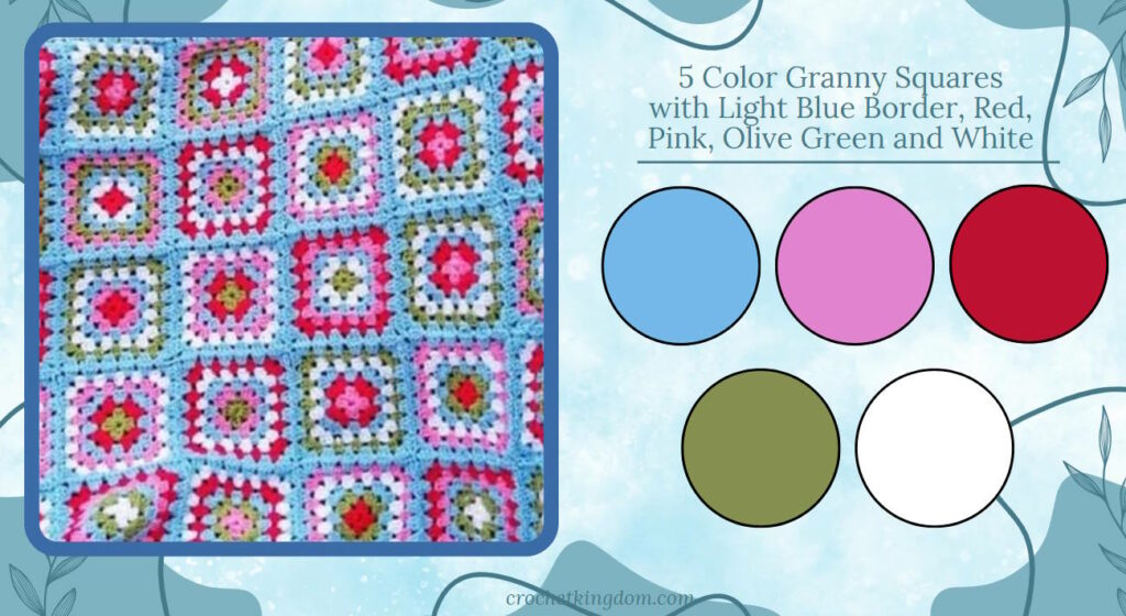
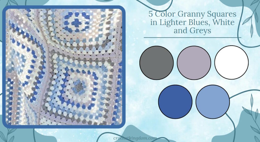
5 Color Granny Square Blanket
Winter Palette color inspiration for granny square afghans.
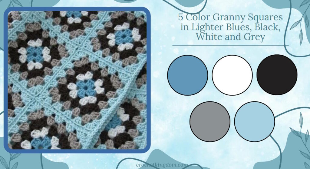
Frosty Pallete inspiration.
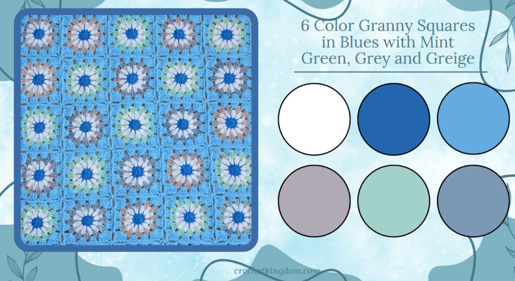
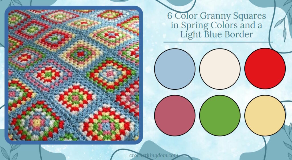
6 Color Granny Square Blanket
Cool, soft granny square blanket color ideas.
Colorful spring colors granny square color scheme.
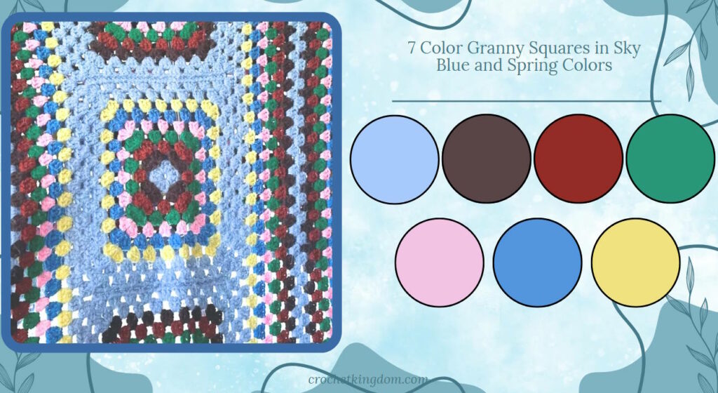
7 Color Granny Square Blanket
Sky blue and spring colors.
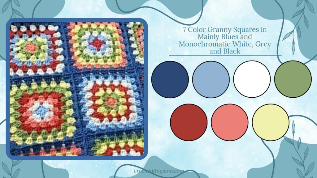
Colorful granny square blanket
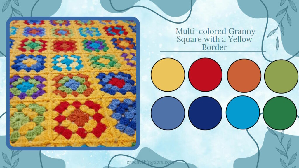
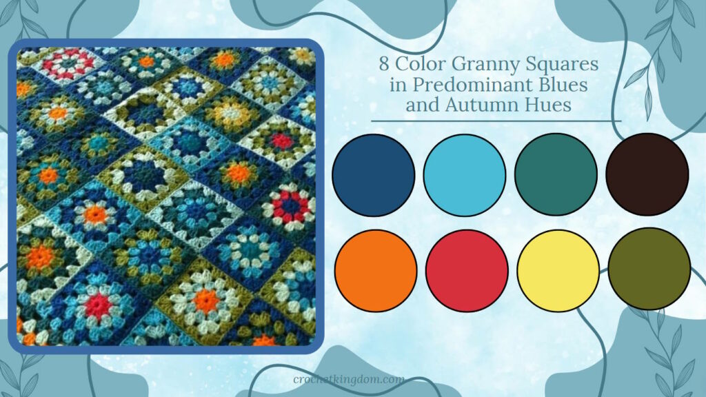
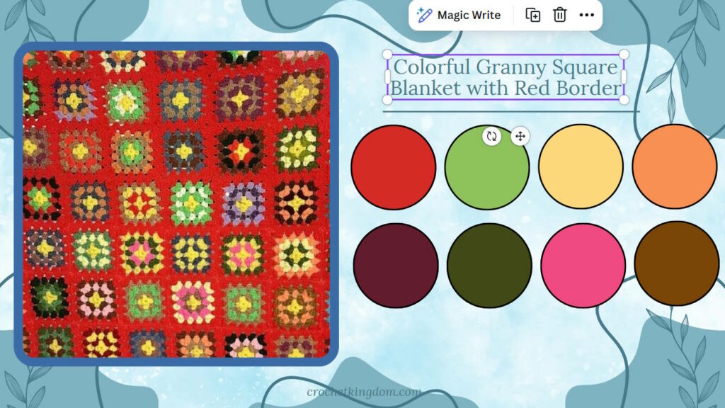
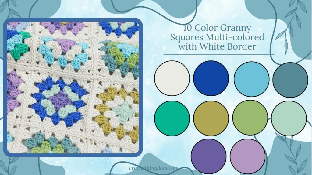
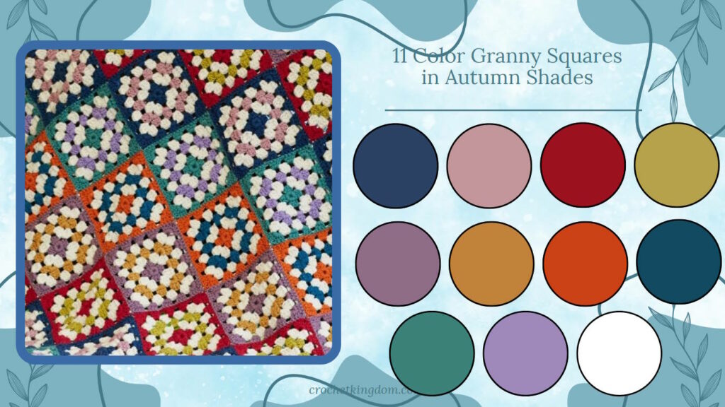
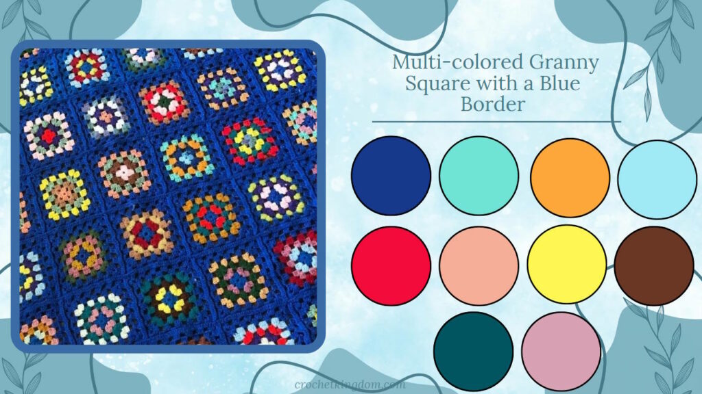
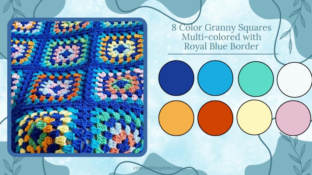
Image sources: My own work and pinterest.